

Warming up to better data
Why don’t energy providers provide better data representation and feedback to their customers?
I do love finding patterns in data. A few years ago, in a previous home, the British Gas website had the ability to display your monthly readings for the last two years. Being an engineer, I naturally loved comparing our usage across the seasons and years. I could see the severity of the winter, how it was reflected in our energy usage and the impact of changes we made.
Clearly there’re weren’t enough enthusiastic geeks like me out there because British Gas quietly dropped this feature, and so I got into the habit of writing down and graphing the monthly readings myself (Yes, I know. It’s a bit weird)
Given the rich and regular data now available from a smart meter, and how our supplier Ecotricity normally seems pretty tech savvy, I am surprised that it doesn’t give any similar option on its current website or apps. However, since we bought and completely refurbed a 1967 modernist house around three ago I wasn’t going to drop the habit, so now I have over two years of data to tell me how things are going …… and importantly, are there any things I can do to improve things in this crisis winter?
So what can I see in the data?
House basics
We bought the house with an EPC rating of F. The calculations done for the refurbishment took it up to a high C, and when we add the planned ground mounted photovoltaics (foolishly not added yet) it will get to B. Huge amounts of insulation were needed to achieve this shift in EPC - but there was practically none before!.
A gas boiler provides the majority of space heating, and hot water is supplemented by solar thermal panels on the roof. Some local winter electric heating is used in the bathrooms (towel rails and floor pads) and occasionally a wood burner is lit downstairs. There are two occupants most of the time, occasionally rising to three. Cooking is all electric.
Gas
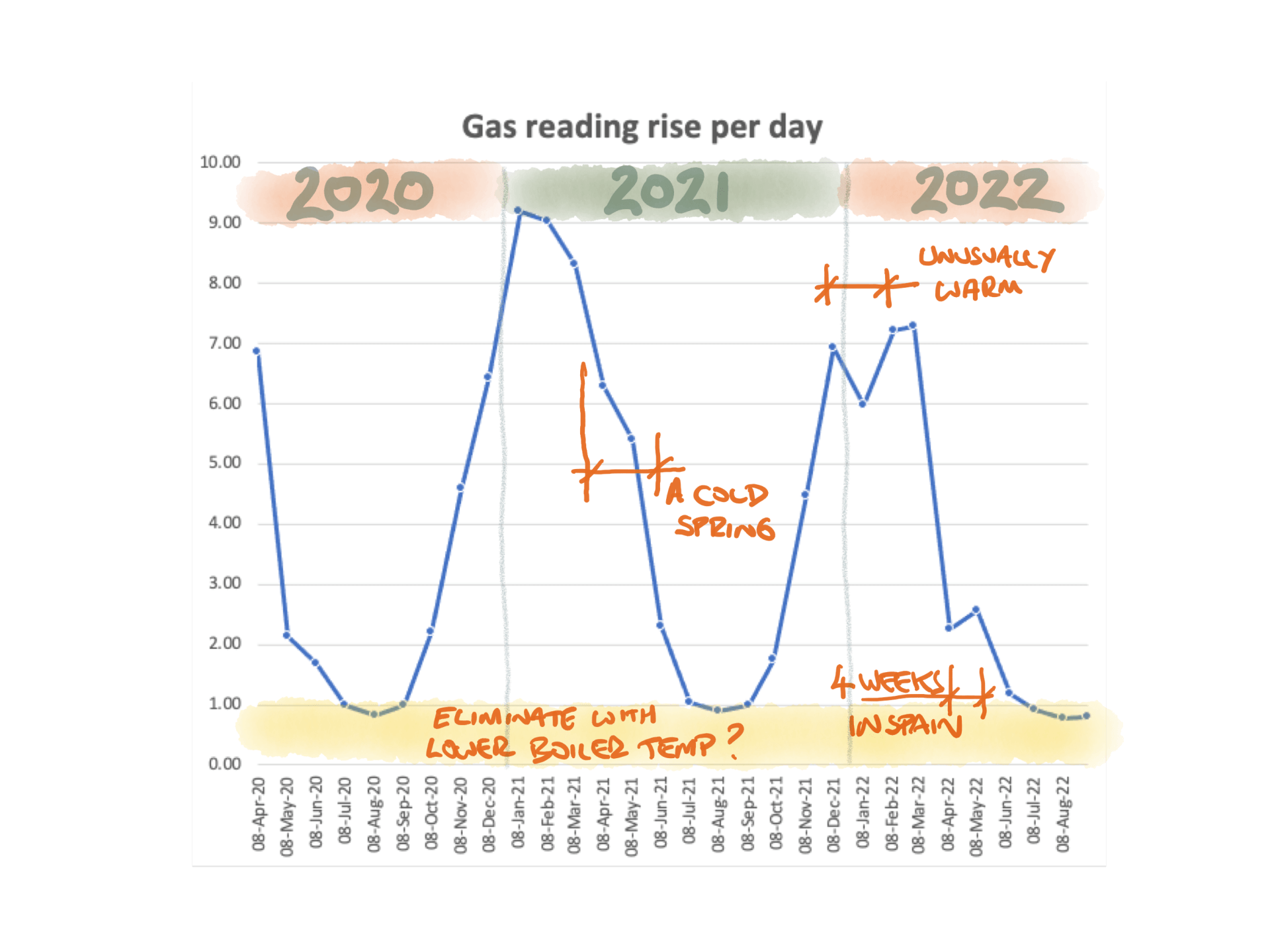
The first thing that is clear from the data is that our gas usage is very seasonal. There are three months in the summer when we basically don't use fast (but see below for thoughts about the bit we do).
Also, that not all winters are the same. 20/21 was much colder, and went on much longer than the winter of 21/22 - so hence more gas/area under the graph. The weirdly warm start to 2022 is also clearly visible (our frogs were active at the start of February, but harder to graph). All fingers crossed for that winter 22/23 is not too severe across Europe!
Although there are other carbon/climate impacts, the ‘home bonus’ of going to Spain for four weeks spanning March and April 2022 is clearly visible in the data.
The big opportunity is perhaps indicated by the fact we still use some gas in the summer.? Due to our solar thermal water system, we are almost gas free for three months in the summer – but interestingly, not quite. I am left wondering if reducing the boiler temperature for hot water (currently very hot in the taps) could lop the bottom part of this graph off across all the seasons. That could be significant. The boiler seems set to 57degC for hot water at the moment. Could this be lower?
Thinking ahead, we could also test whether our big vertical panel radiators (I'll admit they were mainly bought for looks) can still deliver with the lower temperature water from any future air-sourced heat pump. At the moment the boiler is set for 75degC - could I save by going lower and still be comfortable?
(Probably like most people I have never tweaked the settings left after first install. Should I?)

Electricity
We have more data for electricity, spanning right back to November 2019. Unlike gas, which is almost completely seasonally dependent, our summer electricity is around 60% of the winter figure.
The home ‘holiday bonus’ of travel is again visible with the pre-Covid seven weeks spent in India in January and February 2020 very marked. Pretty much all appliances other than the internet were turned off during those periods.
The other thing that jumps out is how our summer minimum has dropped in 2022. We turned off one of the freezers at the start of April (we were over enthusiastic in freezer provision whilst building) and can see that difference on the graph.
The choice coming this winter will be how much we should use the local electric heating in the bathrooms.
Conclusions
I find seeing our energy usage in this way much more meaningful than just a sum of money on a bill. It immediately gives me a feel for what we are going to use this winter and ways that we may be able to influence the outcomes.
- Electricity is less seasonally dependent than gas, and the only way to bring it down appears to be to turn off something that uses serious power like a freezer. That can be supplemented by smaller decisions around lights, etc.
- Our gas use is going to ramp up at the end of September as there is less solar boost for hot water. Then will come the big peak through to April for space heating. This is very dependent on the winter weather, but we may be able to improve things significantly by lowering boiler temperatures.
I can’t see why every energy provided can’t give similar graphs to every user with a smart meter. Some people will find this richness of data confusing, and they will not look at that option on a website, but even if only ten percent did there could be a significant difference. Could AI look at fluctuations and ask what changed during good or bad periods? This active feedback could save energy and money for the smarter consumers!
The wood burner’s logs have been delivered. The graphs are about to head upward. Winter is coming. Wrap up well.